User Buttons
User buttons are a way to quickly add tools to the Excel toolbar, running R code. This is particularly useful if you have a common analytical function. Here’s an example. Enter the following in the console:
BERT$AddUserButton( "Histogram", function(){
	Selection <- as.numeric( Get.Selection());
	if( length( Selection ) > 2 ){
      hist( Selection );
	}
});
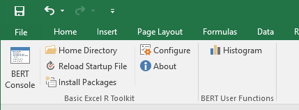
Switch back to the Excel window, and you’ll have a new button in the Add-ins toolbar labeled “Histogram”:
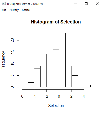
Select some numbers in your spreadsheet and click the button; you’ll see a histogram of the data:
There’s a better version of the histogram button at the end of this page.
Installing User Buttons
Installing user buttons is done entirely from R, by calling the function BERT$AddUserButton.
BERT$AddUserButton( label, FUN, imageMso )
| label | The text label for the button |
| FUN | An executable R function |
| imageMso | An image for the button (optional) |
The image is controlled by the imageMso parameter; this is a text string, and refers to the default Office buttons. A list of string values and the associated images is available here.
To remove user buttons, use the function BERT$ClearUserButtons.
You can add up to 6 buttons; they’re added in order. This is designed to be included in your startup script, although you can add buttons at any time. Typically, in your startup script you would first include a call to ClearUserButtons, then add buttons. This way when the startup file is reloaded, the buttons will be reinstalled.
Finished Example
Here’s a better version of the histogram button, which we use all the time. It requires the library ggplot2; you can install that with install.packages("ggplot2"). Once you have the library installed, put the following in your functions.R file:
library( "ggplot2" );
BERT$ClearUserButtons();
BERT$AddUserButton( "Histogram", function(){
s <- EXCEL$Application$get_Selection();
m <- as.numeric( s$get_Value());
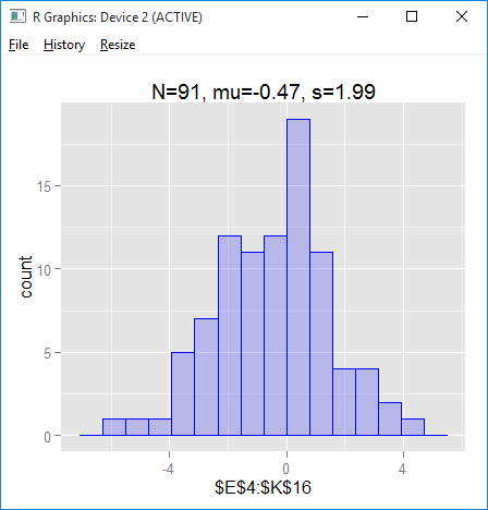
cap <- sprintf("N=%d, mu=%3.2f, s=%3.2f", length(m), mean(m), sd(m));
if( length( m ) > 2 ){
a <- s$get_Address();
qplot( m, geom="histogram", fill=I("blue"), alpha=I(.2), col=I("blue"),
binwidth=diff(range(m))/13, xlab=a, main=cap );
}
}, "Chart3DColumnChart");
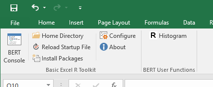
Note the last parameter, "Chart3DColumnChart"; that’s an imageMso value, as listed on this page. It adds an image to the button:
When you click the button (with some data selected in the spreadsheet), it generates a histogram and some useful statistics: